Geisinger Wellness Portal
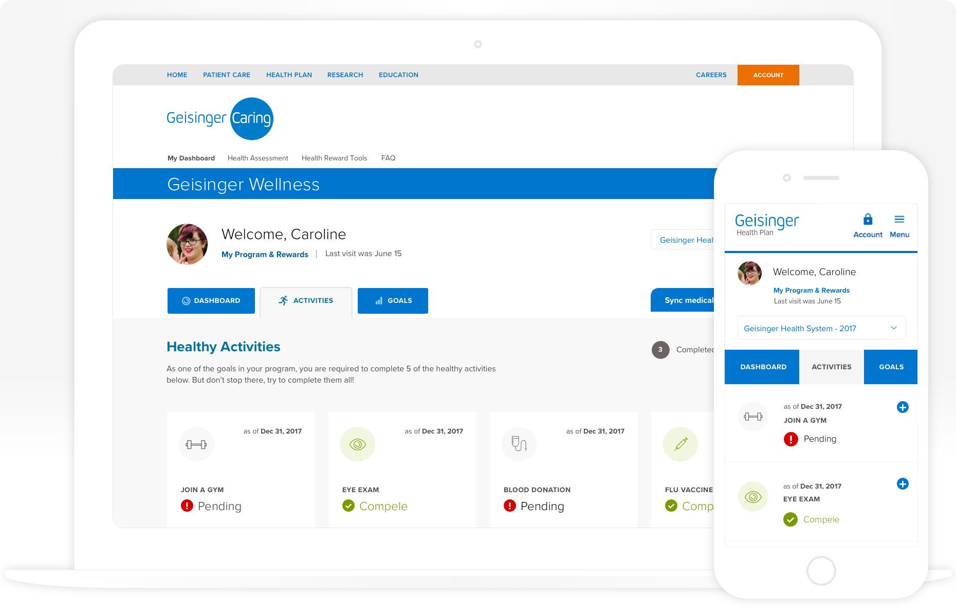
Geisinger Health wanted to improve the overall engagement level of the Caring™ Wellness Plan portal.
We worked with their team to completely re-think both the interface and interactions that plan members would experience online. We helped them shift from an experience flooded with business requirements, to a customer-centric mental model that focused on helping people.
My role:
Creative direction
Primary UX/UI designer
Workshop facilitation & interviews
Customer journey maps & strategy
Wireframes & user flows
Details:
2017 for Connective DX
Positive reinforcement
We had a large team of client stakeholders. Very large. In order to create alignment, I planned and facilitated workshops to better understand user behaviors and goals. We wanted their team to hear first-hand what their user needs were.
As we developed our interaction strategy, we were able to map user behaviors to product features, content engagement opportunities, and an overall shift to a human-centric design solution.
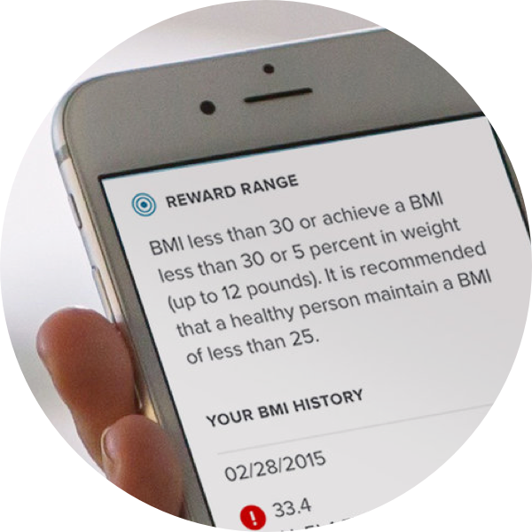
Our goal, from a business standpoint, was to build a framework that would help patients towards achieving their health goals through positive reinforcement. We would use both messaging and visual signaling to accomplish this.
Putting in work:
Increased platform adoption
Increased and improved interaction by program members
Helped people get healthy
Throughout the UX/UI design of the portal, we relied upon problem statements and hypotheses formed during the evolution of our strategy. Micro-interactions were a strong consideration throughout the design process, with complete design sprints dedicated to:
Registration process
Contacting a health coach
Completing consent forms
Editing personal information
Nesting the portal navigation schema
This was one of the first projects I’d ever worked on where we tried to combine UX and Agile. Since we’d visualized entire user flows as part of our strategy, I was able to work closely with the developers, as I always do, to break down the components, patterns, and flows for each.
This allowed us to put our design/build of each piece against a roadmap, and that roadmap directly informed our sprints.
Design system patterns & scenarios
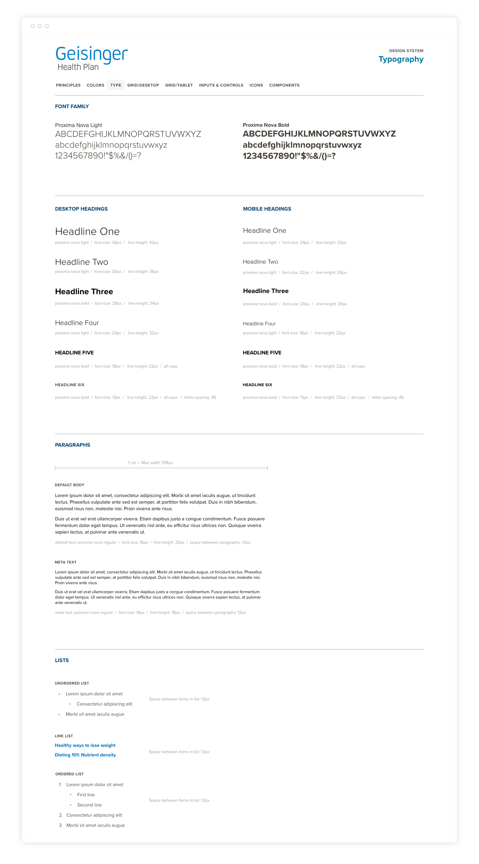
We wanted our portal to align with the existing brand language—the button styles, colors, and more. However, in order to truly deliver a flexible framework that could pay off on our strategy, we needed to build out a complete design system.
Looking at all of the different state-changes in our interaction flows, we were able to discern the variety of UI patterns and scenarios that needed to work together seamlessly. This set us up to apply the branded visual identity to every aspect of the system.
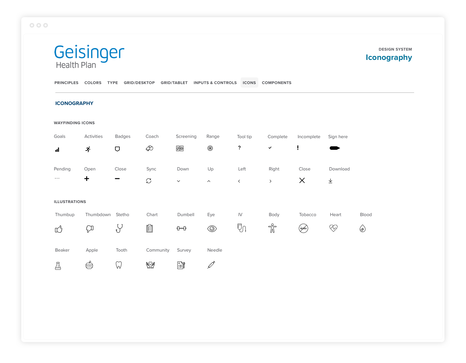
One of the more satisfying parts of the system was creating the icon system.

